Plot connectivity metrics across interpatch distances
Source:R/plots-summaries.R
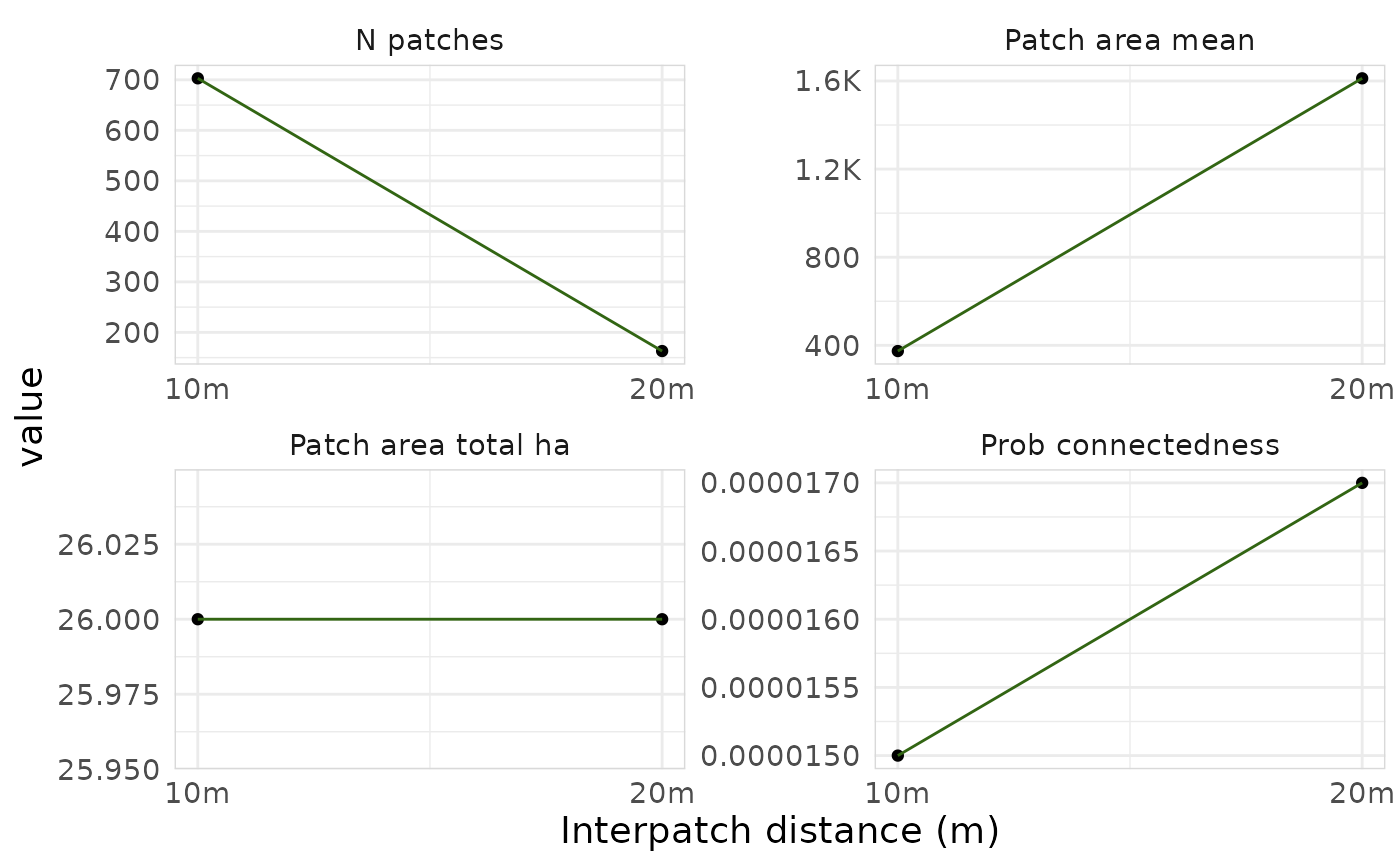
plot_connectivity.RdCreates faceted line plots showing how connectivity metrics change with different interpatch distances. This works best when you have multiple interpatch distances, otherwise it will just be a plot with one point.
Examples
lizard_habitat <- example_habitat()
lizard_barrier <- example_barrier()
results <- purrr::map(
  c(10, 20),
  function(d) {
    full <- habitat_connectivity_full(lizard_habitat, lizard_barrier,
      interpatch_distance = d, verbose = FALSE)
    summarise_connectivity(
      connectivity = full$areas_connected$area,
      interpatch_distance = d,
      data_resolution = 10,
      species = "Blue-tongued Lizard"
    )
  }
) |> purrr::list_rbind()
plot_connectivity(results)